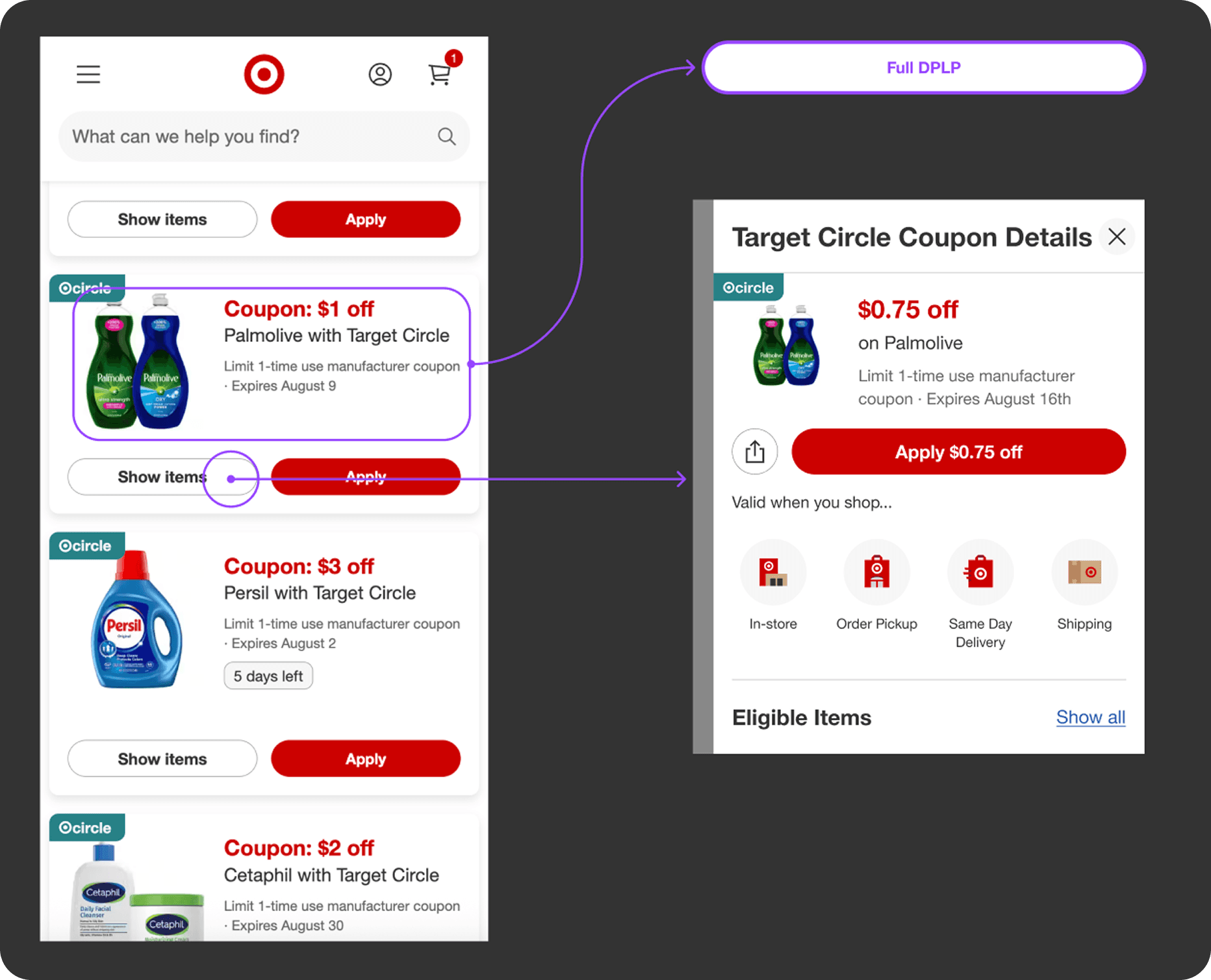
Top Deals: Eligible Items Quick View
Reducing navigational friction while hunting for sweet deals on Target.com.
Organization
Target (Minneapolis HQ)
Contributions
UX Design, User Testing, Design Systems
Timeline
June - August 2025

Overview
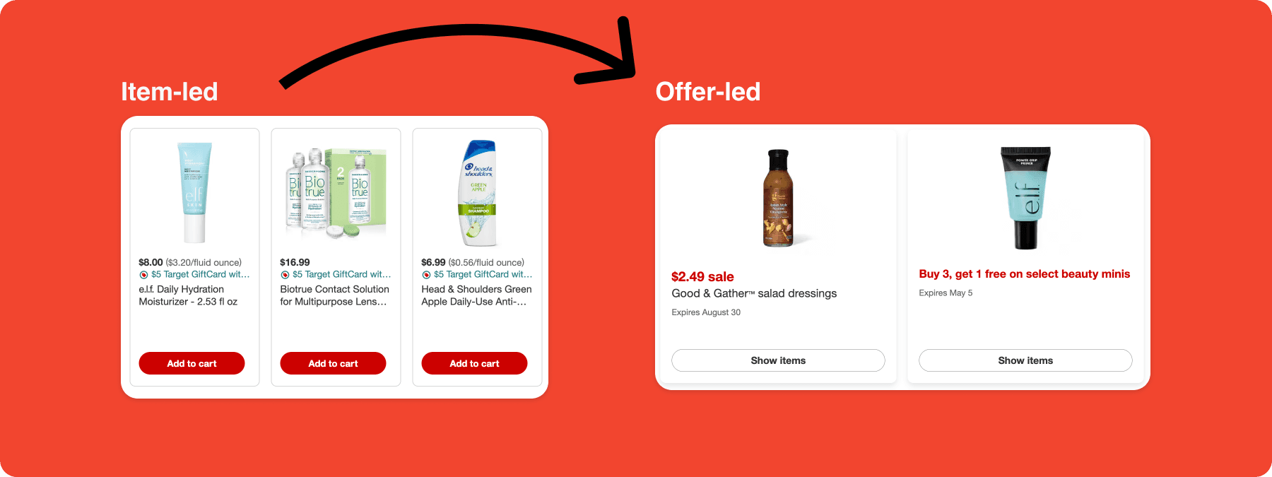
As part of my UX design internship at Target, I worked on the Deals team during their transition to an offer-led shopping experience that aims to help guests discover and act on promotions more efficiently. While the new offer-first model surfaced more deals, it also introduced friction: guests often had to leave the deals grid to browse eligible products, resulting in repetitive navigation and comparison fatigue.
Our team explored a “quick view” experience that allows guests to preview eligible items for a deal without losing context. I contributed to end-to-end design exploration, usability testing, and iteration of a redesigned flyout that balanced transparency with speed. The design solution performed well in our final A/B experiment, validating our impulse that reducing friction directly supports conversion in offer-led shopping.
Research & Insights
Understanding Deal-Hunting Behavior
In the offer-led Unified Deals experience, guests encounter promotions before products. This shift created a new goal: boosting confidence. Guests wanted to understand what they could buy before committing to a deal, especially when comparing multiple offers. Key observations from existing flows and prior data:
Guests frequently “pogo-sticked” between the deals grid and full product listing pages
Each navigation break increased effort during deal comparison
Existing quick-view patterns in other surfaces showed strong engagement, suggesting that keeping guests in context mattered
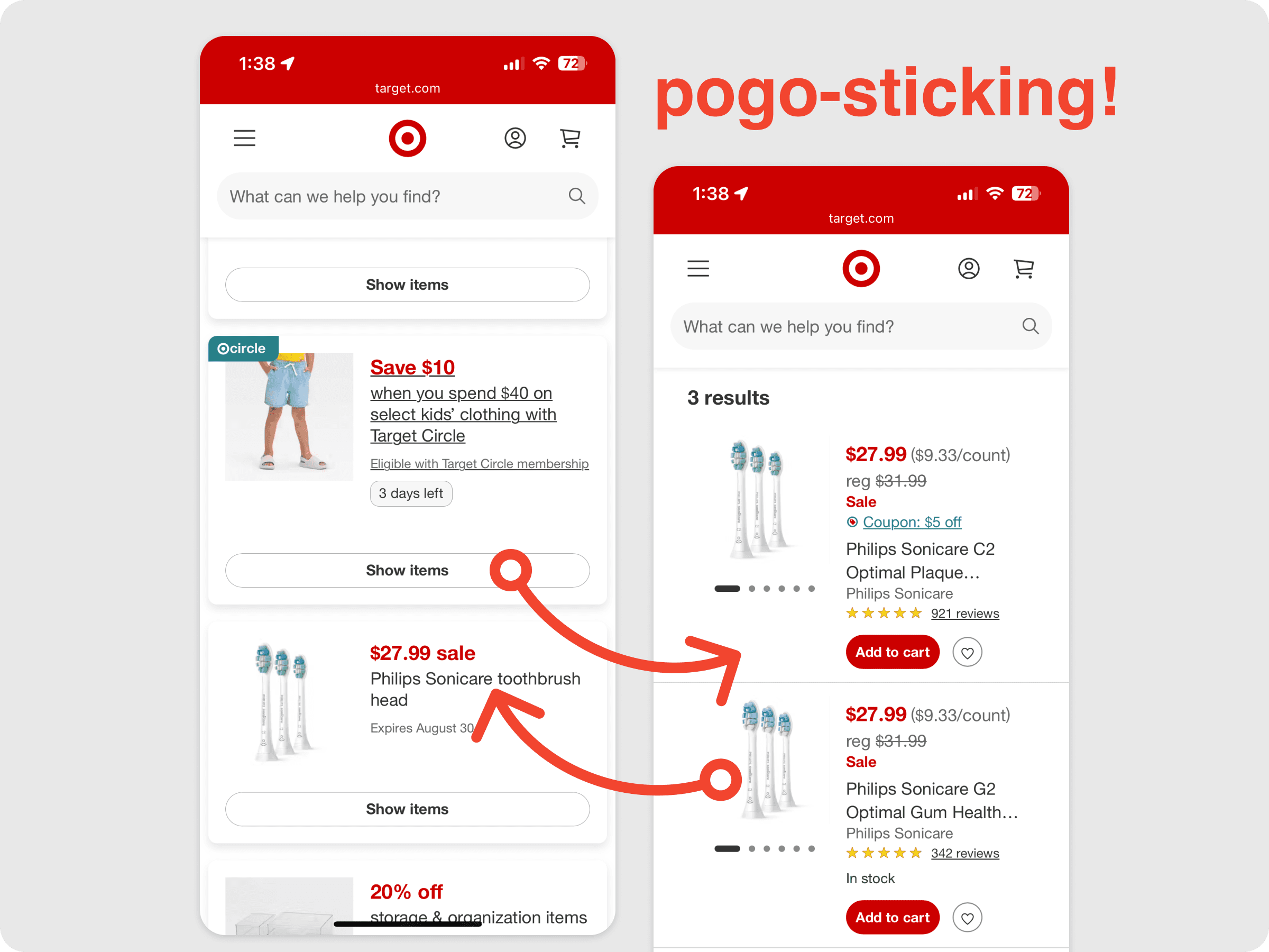
Core Insight: Guests don’t need all items immediately — they need enough visibility to decide whether a deal is worth exploring.
Problem Statement: How might we help guests preview and shop eligible items for a deal without leaving the deals grid or losing context?
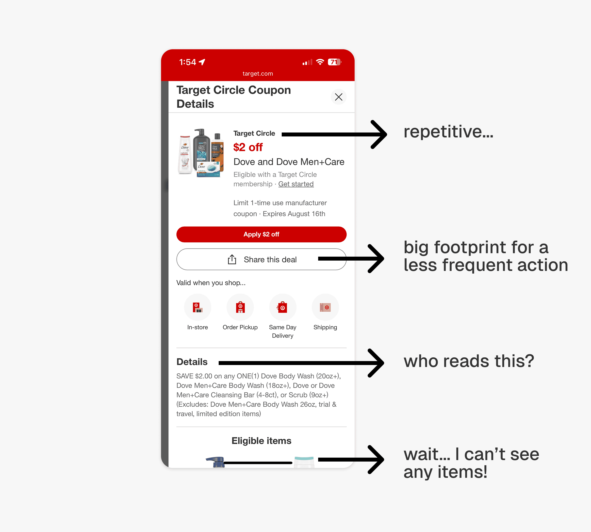
Early Direction
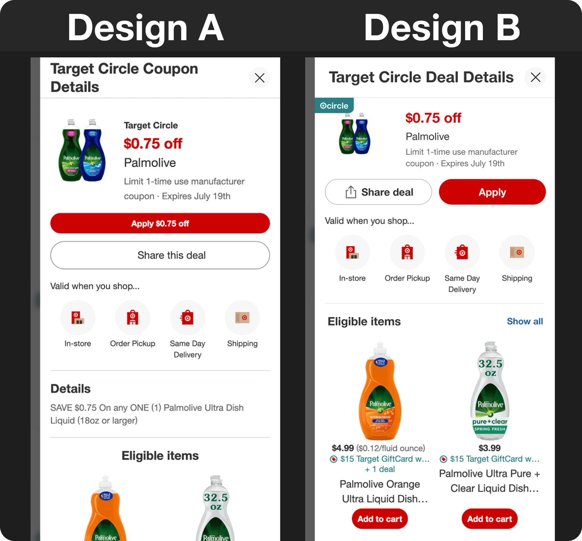
We explored reviving a flyout pattern that had previously existed for some deal types. These earlier versions were removed due to friction, large visual footprint, and low clarity. Rather than reintroducing the pattern wholesale, we reframed the challenge as:
What information is essential above the fold?
What can be progressively disclosed?
How do we support both fast scanning and deeper exploration?
This led to the hypothesis that a condensed, item-forward flyout could reduce navigation overhead while preserving transparency.
Iterating…
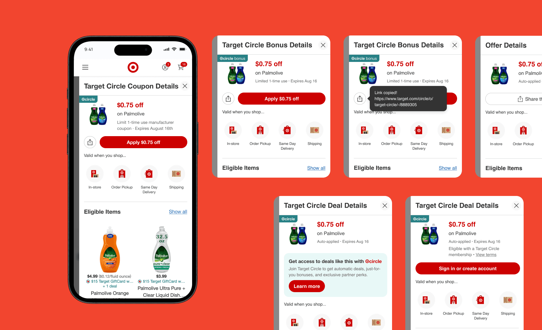
Round 1: Exploratory Testing
Initial designs compared a revised flyout against the existing experience. Feedback from X participants on UserTesting was mixed:
Some users preferred the familiarity of the current pattern
Others appreciated seeing eligible items immediately
Literal differences between deals (not layout alone) influenced preferences
Key takeaway: Visibility ≠ redundancy. Even skimmed information builds trust.
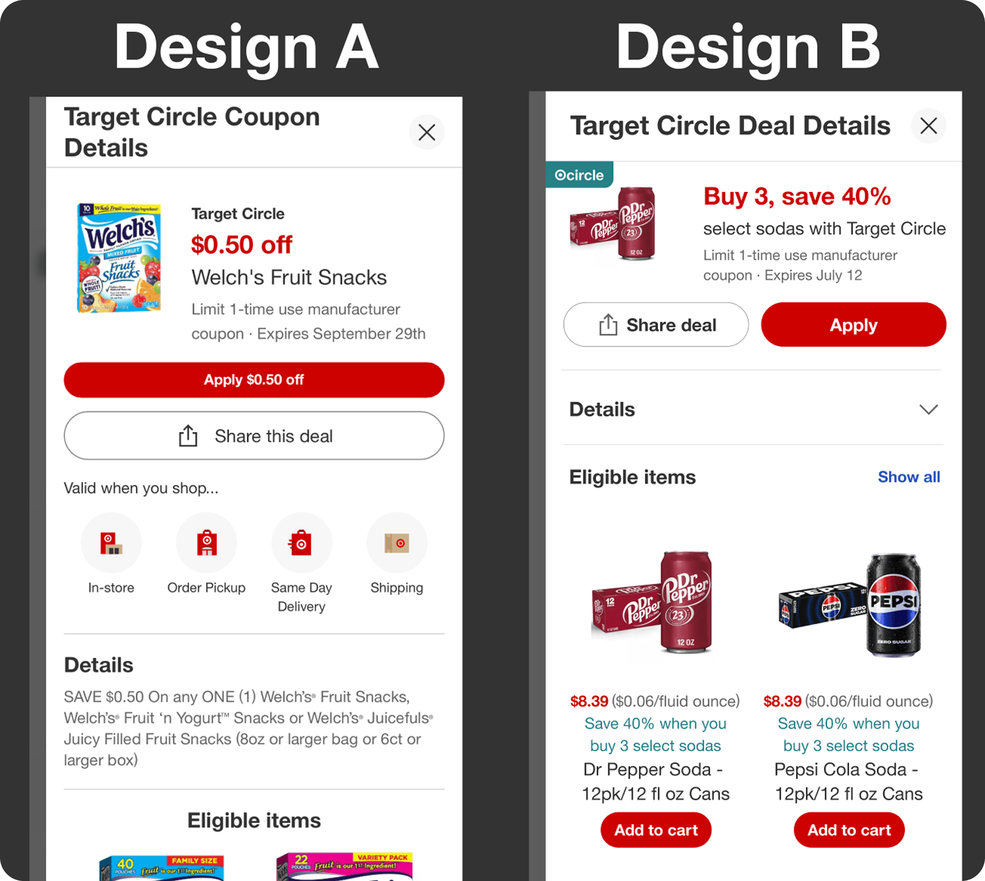
Round 2: Refinement & Retest
To isolate design signal from content bias, we:
Tested identical deal data across variants
Kept fulfillment methods visible
Pushed fine-print details lower in the hierarchy
Prioritized eligible items above the fold
Users reported improved clarity and reduced effort, though preferences remained nuanced—highlighting the tension between efficiency and transparency in retail UX.
Final Solution
The final design reintroduced a streamlined quick view flyout that:
Keeps guests anchored in the deals grid
Surfaces a preview list of eligible items immediately
Maintains clear access to fulfillment methods
Links out to the full DPLP for deeper browsing
Adheres closely to Target’s design system and accessibility standards
The experience was designed across multiple states (signed in/out, Circle vs. non-Circle) and handed off with detailed documentation to support engineering implementation.
Experiment & Outcomes
The redesigned quick view was shipped as an A/B experiment. The treatment met the benchmark for add-to-cart lift and was approved for production rollout, indicating that the design meaningfully improved guest engagement under real conditions.
Next Steps
Continue refining information density as deal types expand
Explore adaptive layouts for deals with very small or very large eligible sets
Further investigate where friction is productive versus where it should be removed
Reflections
Challenges
Designing against prior pattern failure without overcorrecting
Navigating close, non-binary testing results
Balancing instinct with data when metrics were directionally positive but not overwhelming
What I Learned
This project reshaped how I think about data, confidence, and decision-making. I expected metrics to make choices obvious; instead, close results forced me to lean on judgment, clarity of intent, and iterative learning.
I learned that:
UX decisions are rarely binary
Some friction supports trust
Designing at scale means optimizing for patterns, not perfection
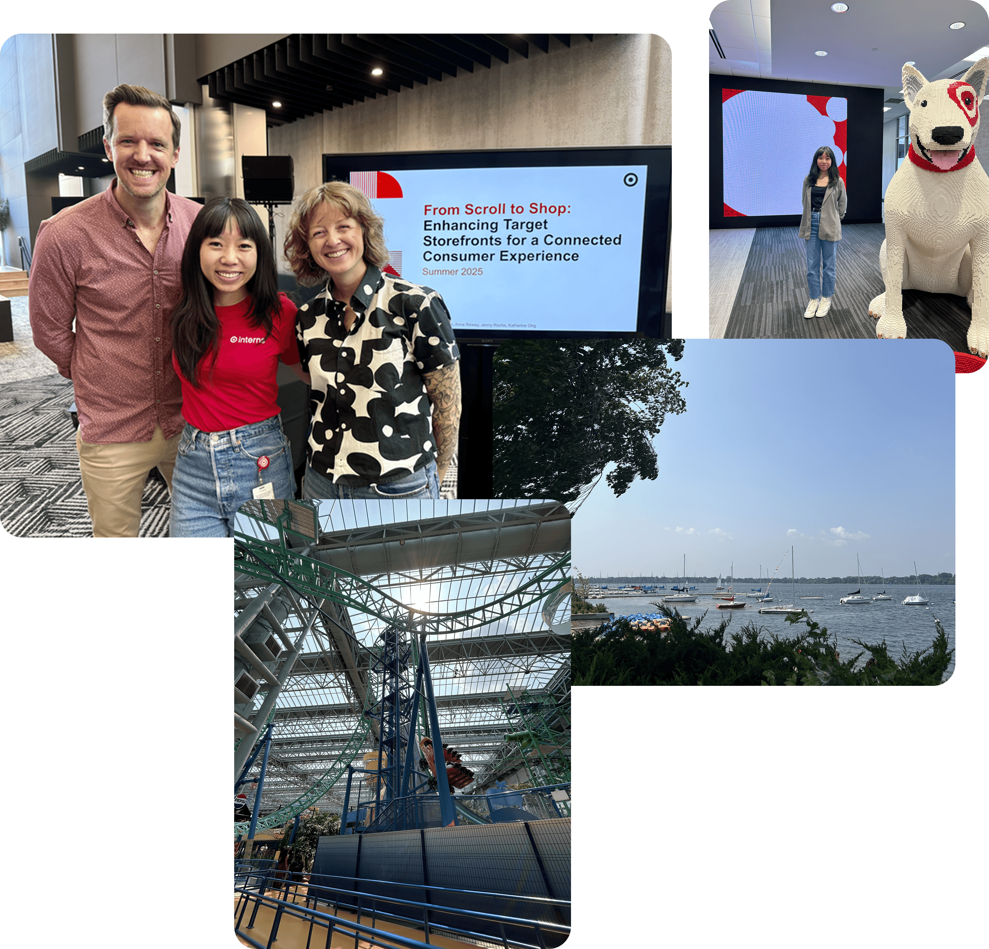
Thank you to my mentors and to Minneapolis for a great summer!
Thanks for visiting!
I'd love to chat about projects,
opportunities, and all things design.
Contact me :)