Establishing a Web Presence for a Local Tutoring Nonprofit
Boosting student registrations by 140% for a local tutoring organization in Davis through ground-up, mobile-first web design.
Organization
Interactive Elementary Learning Center
Contributions
UX/UI Design, Web Design, Branding
Timeline
February - March 2023

Overview
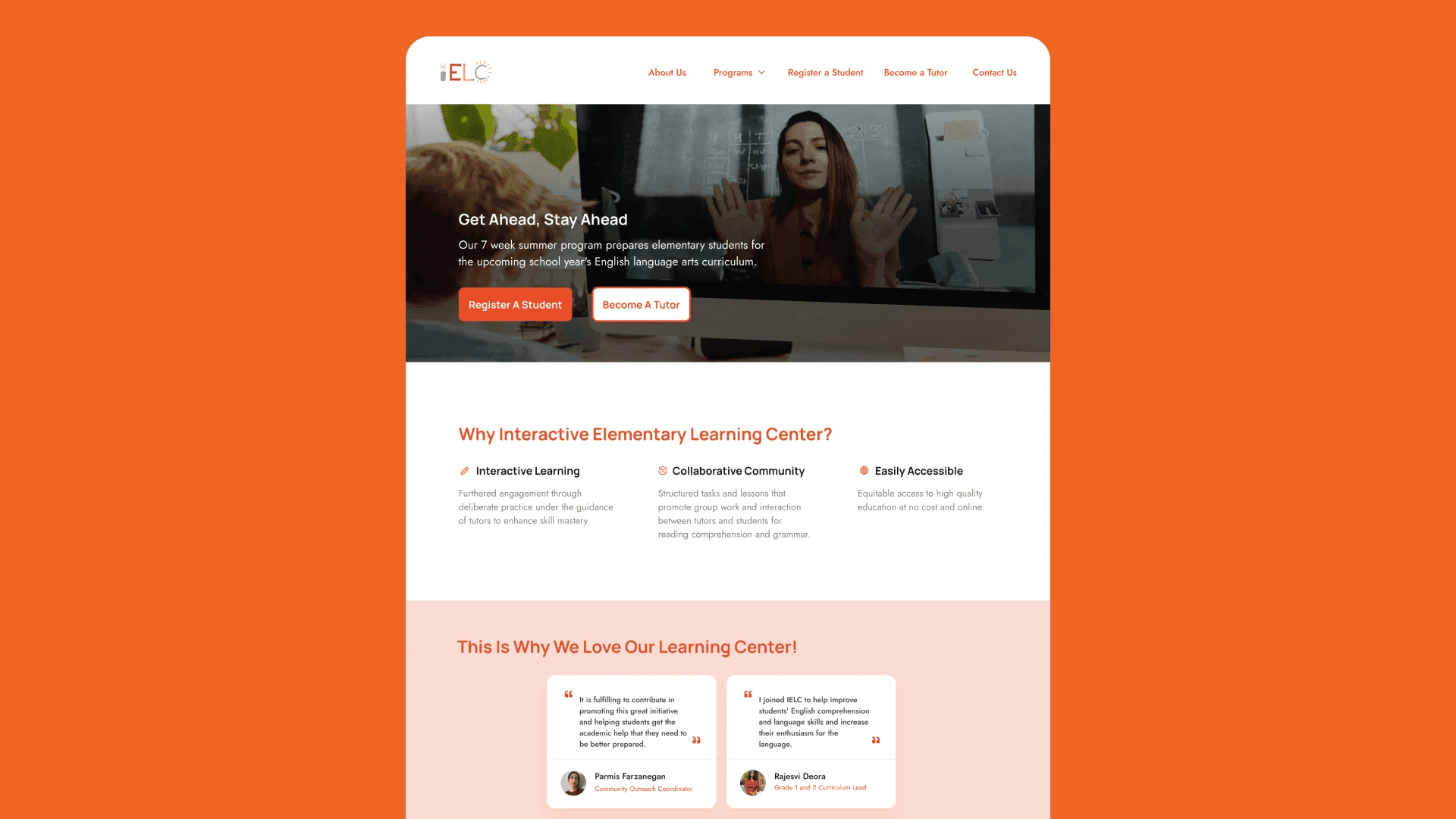
The Interactive Elementary Learning Center (IELC) is a free 7-week summer program, helping elementary students prepare for the upcoming school year’s language arts curriculum.
Project Goals: Foster trust and reliability with parents to promote new registrations. Provide clear, transparent information to support their decision-making.
Challenge: IELC was a newly established organization with no online presence beyond Instagram. The lack of a website limited their ability to inform parents about their programs and showcase credibility.
My Role
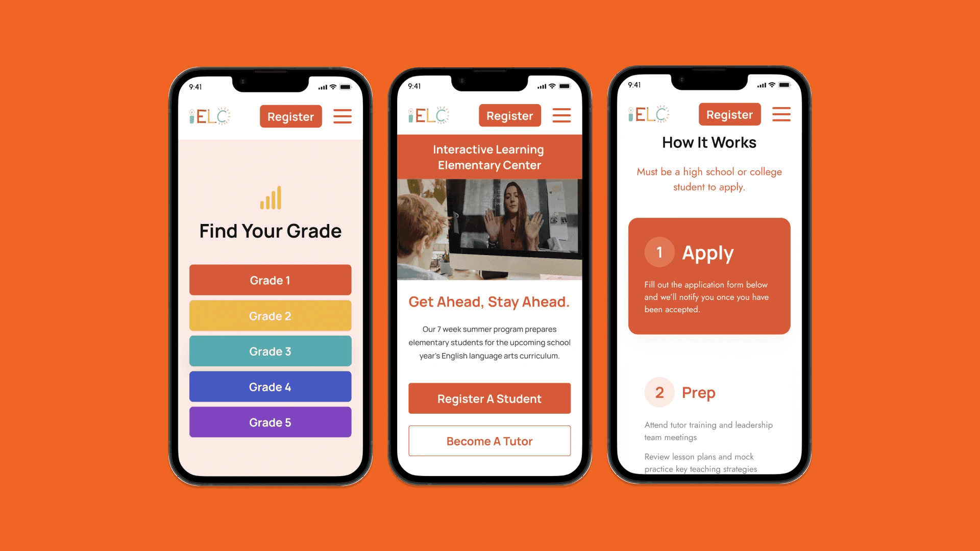
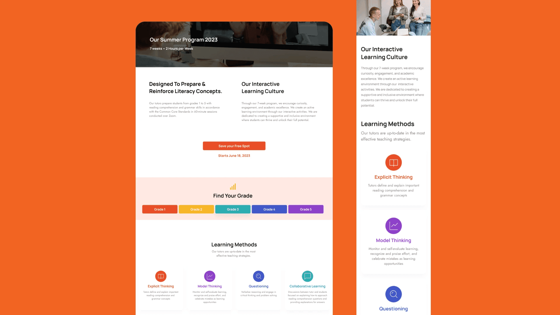
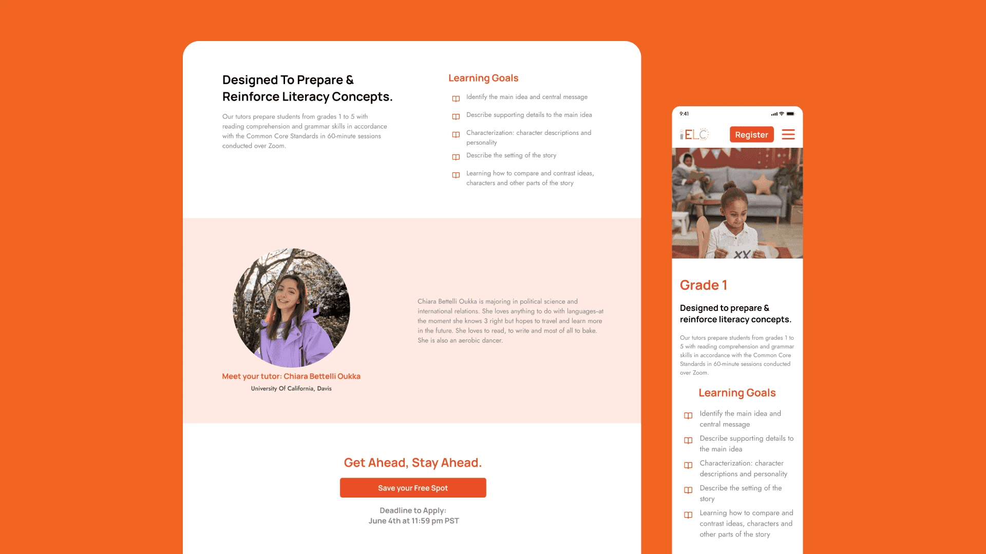
I led the design of the Programs Overview and Grades pages. My goal was to build trust with parents by providing detailed, accessible information on IELC's programs and grade-specific curriculums, encouraging them to enroll their children through informed decision-making.
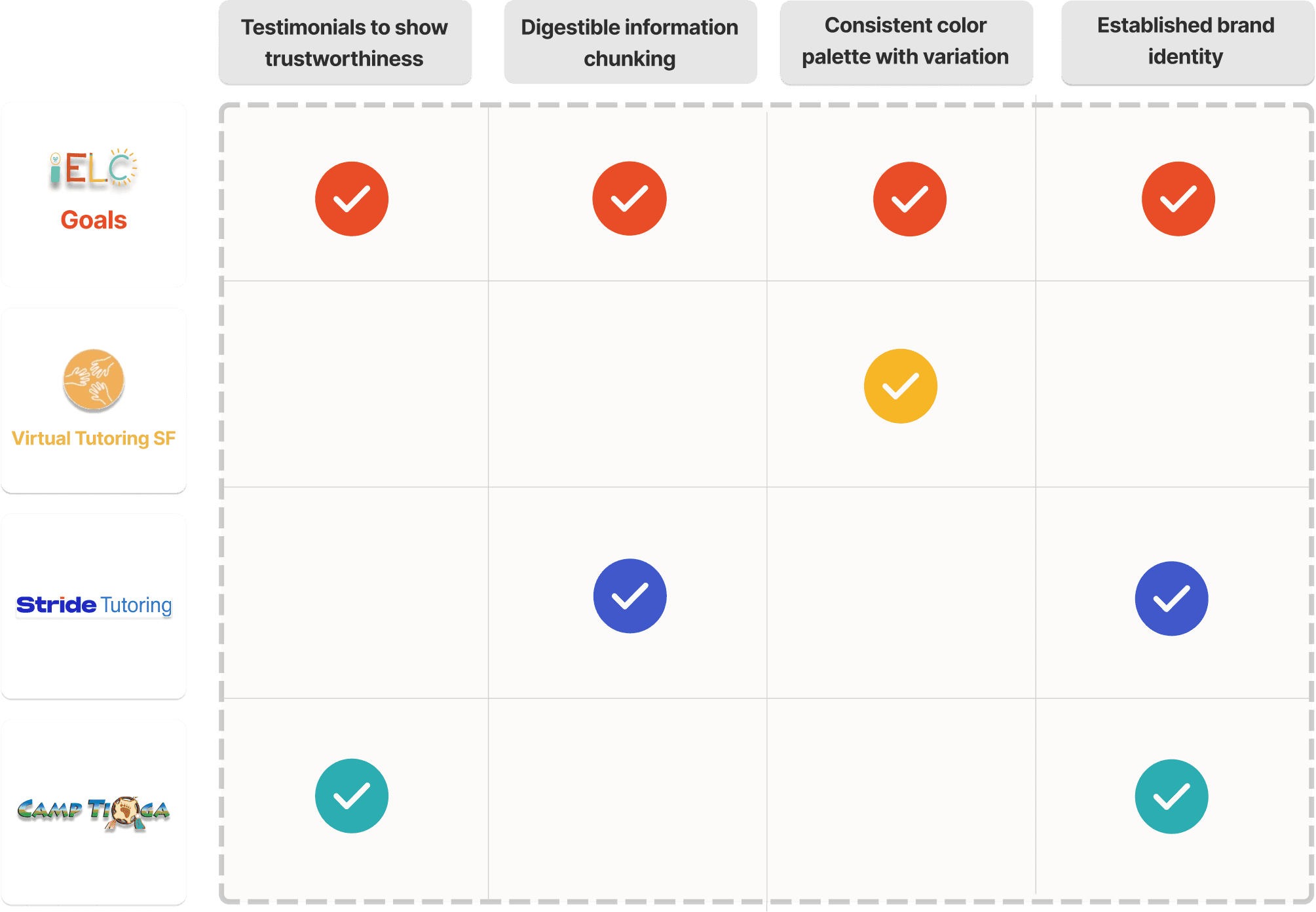
Research
We reviewed other educational programs to identify trends and best practices, focusing on parents as the primary audience, gathering insights on what builds trust and strengthens parent confidence.
Clear Branding establishes trust and reinforces legitimacy.
Concise, Scannable Information reduces friction and builds confidence.
Program Details and Testimonials are critical to informing decisions and easing doubts.
Synthesis
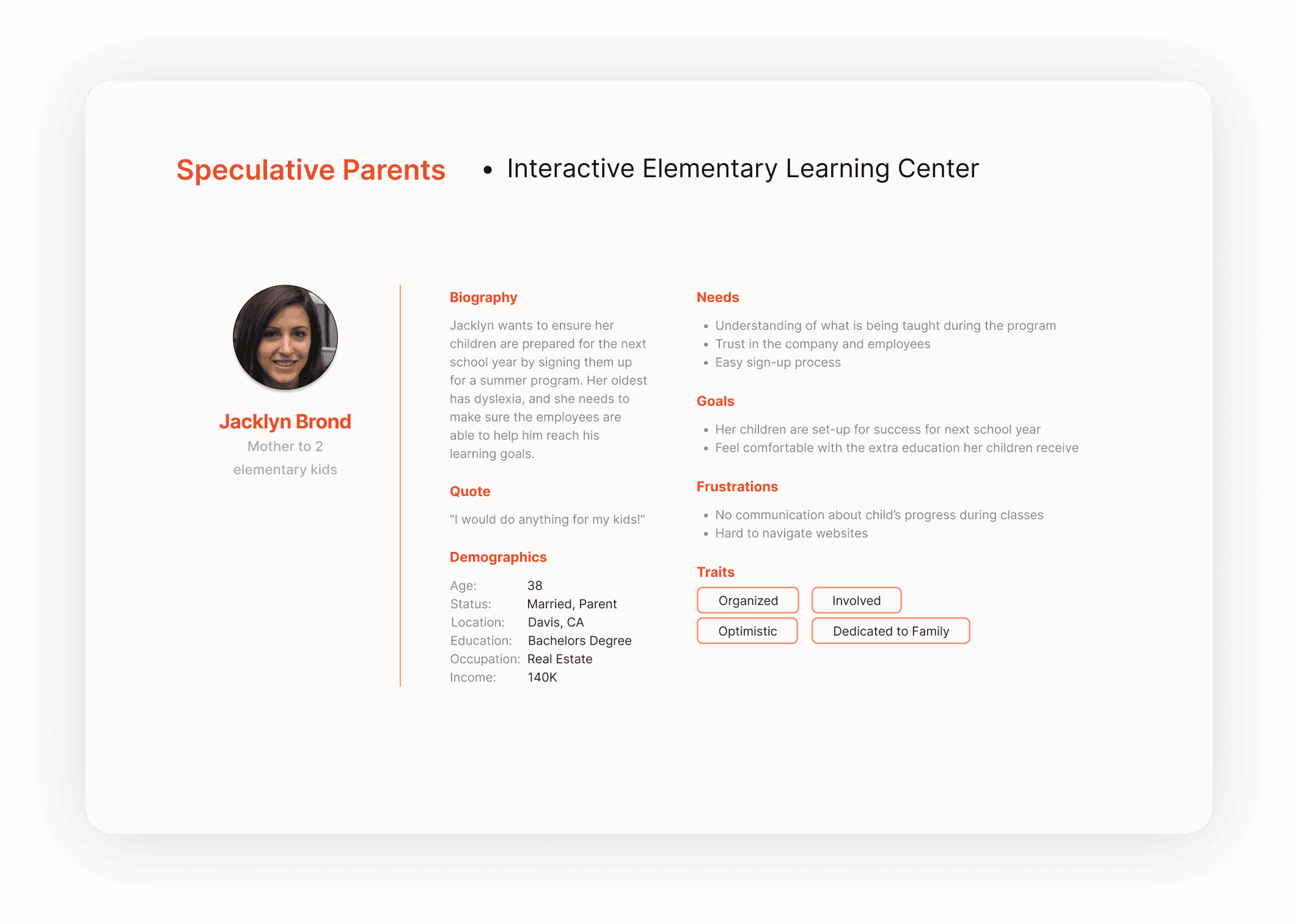
From my research insights, I created a user persona to empathize with just one person instead of an entire demographic: a parent who prioritizes their child’s academic growth, seeks transparent information about programs, and values transparency when selecting educational services.
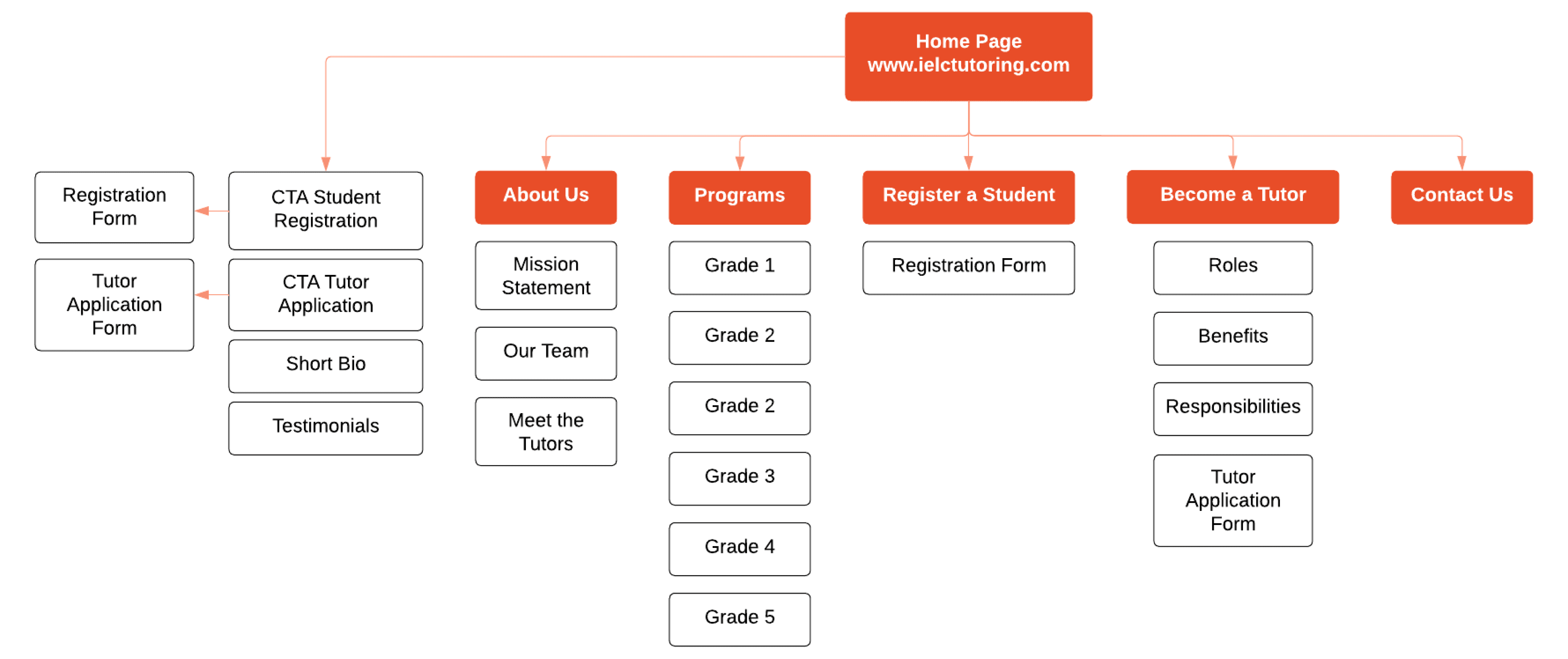
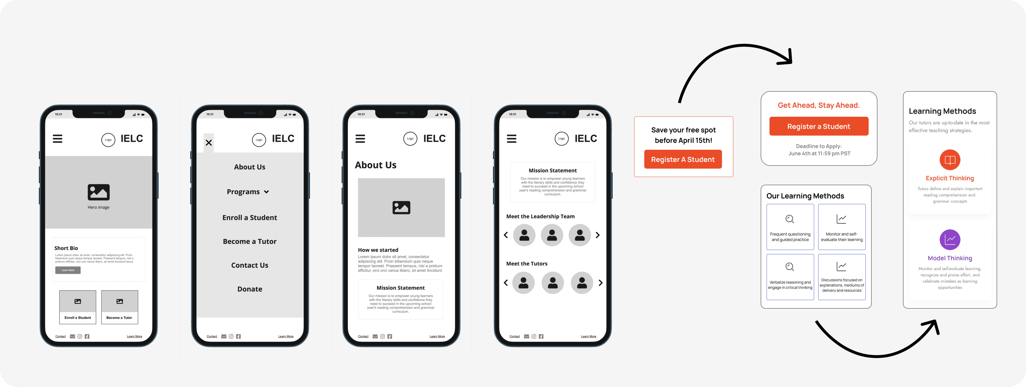
Information Architecture
We created a user-friendly sitemap, ensuring the site’s flow was intuitive and aligned with parents' mental models. Programs were organized by grade level, with clear CTAs leading to registration.
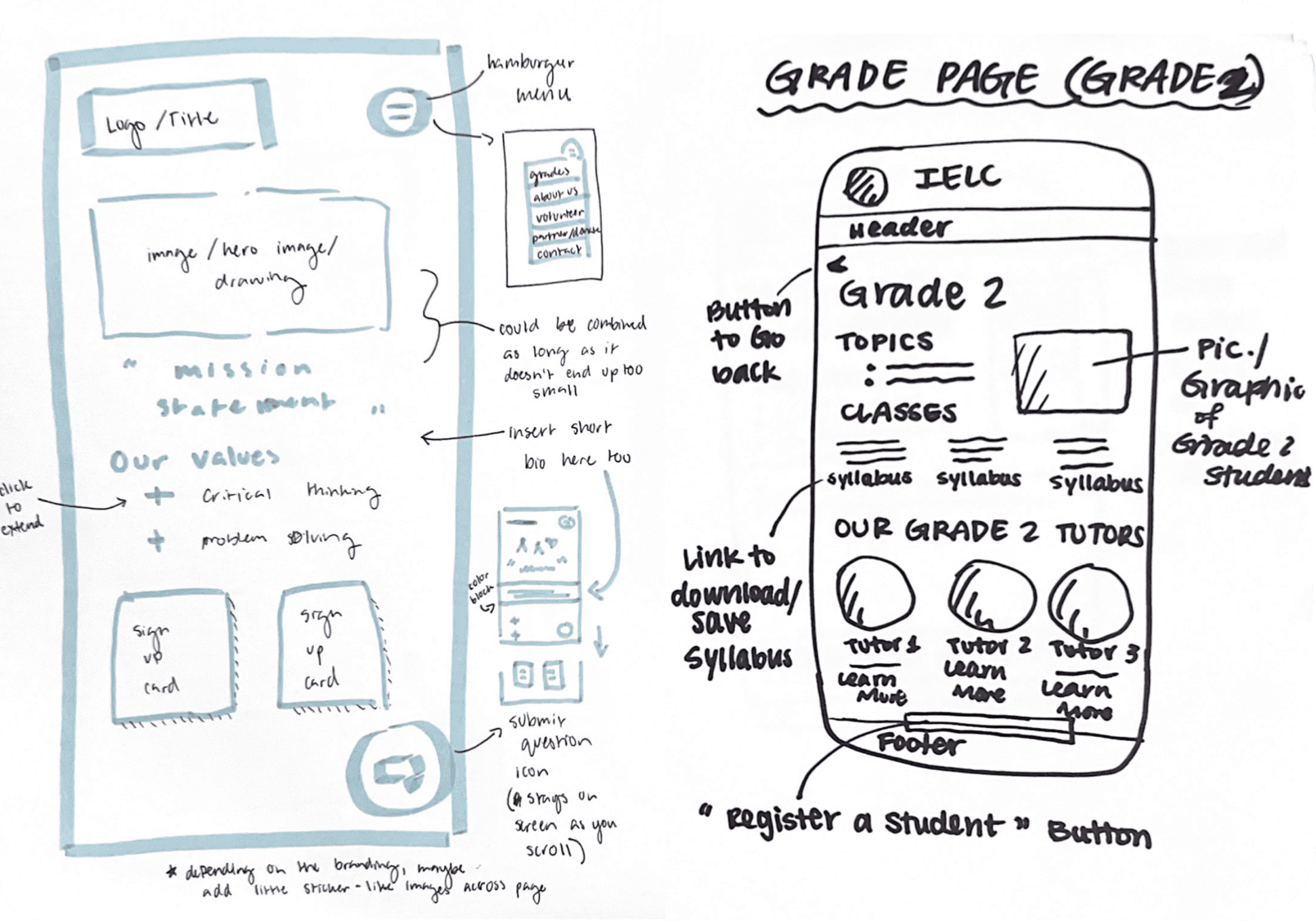
Ideation
To effectively communicate trust, we started on paper to iterate on different layouts that highlight key information. Programs pages showcased detailed descriptions of each program's goals and benefits. Grades pages provided specific breakdowns of what students in each grade would learn.
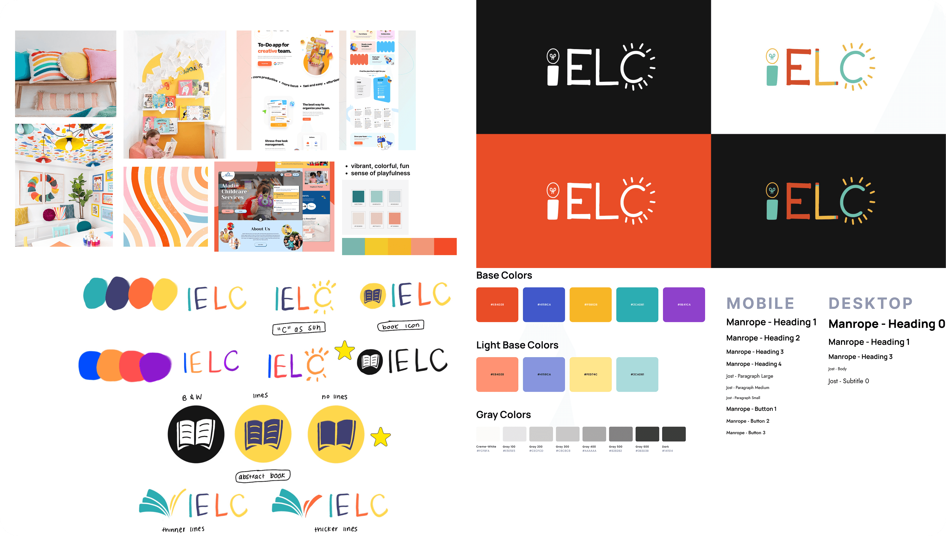
Branding
Color Palette: Bright, playful colors associated with elementary education.
Typography: Sans-serif fonts for clarity and readability.
Visual Elements: Icons representing books, apples, and other educational imagery to engage users visually.
Iterating…
Throughout the design process, we gathered feedback from the development team and stakeholders, refining the pages based on input. Without time for formal user testing, we applied rapid feedback cycles to improve the designs. We focused on hierarchy to prioritize CTA's and ensure the most important details were prominent, and simplified dense content into clear, digestible sections.
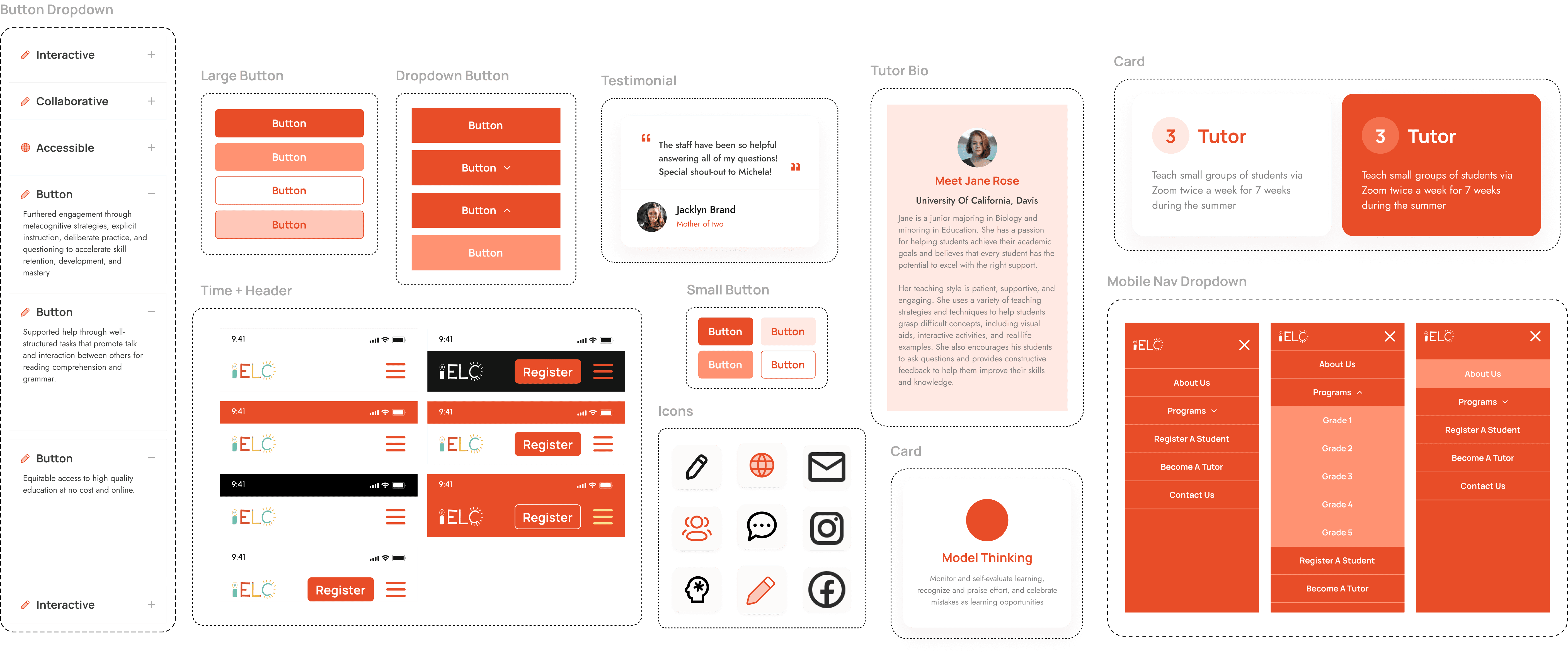
Design System
Colors: Vibrant, child-friendly tones to evoke a sense of play.
Typography: Used the same sans-serif fonts across pages for a cohesive experience.
Buttons and Forms: Designed for accessibility with clear labels and feedback mechanisms
Final Solution
We developed a responsive, user-friendly website that empowered parents with the information they needed to make confident decisions. Key features I contributed included:
Programs Overview Page: Highlighted program benefits to engage parents early in their search.
Grades Page: Offered tailored information by grade level to ensure parents found relevant details quickly.
Clear Calls-to-Action: Encouraged parents to register by embedding easy-to-access registration buttons throughout the site.
Handoff & Launch
After publishing the site, we noticed users found it unintuitive to double-click "Programs" to access an education overview, as they expected only the dropdown of grade levels. To improve navigation, we added a "Programs Overview" link beneath the dropdown. This change enhanced affordance, visibility, and usability, making it easier for parents to explore the offerings.
In the end, our project was a success, spurring a 140% increase in registrations in the first month!
Reflections
Simplify Information to Build Confidence: Clear, scannable content reassures users and encourages them to take action.
Iterate, Iterate, Iterate: Collaborating closely with stakeholders and the development team allowed us to refine our designs quickly and effectively.
Empathize with Your Audience: Understanding parental concerns was essential to designing pages that built trust.
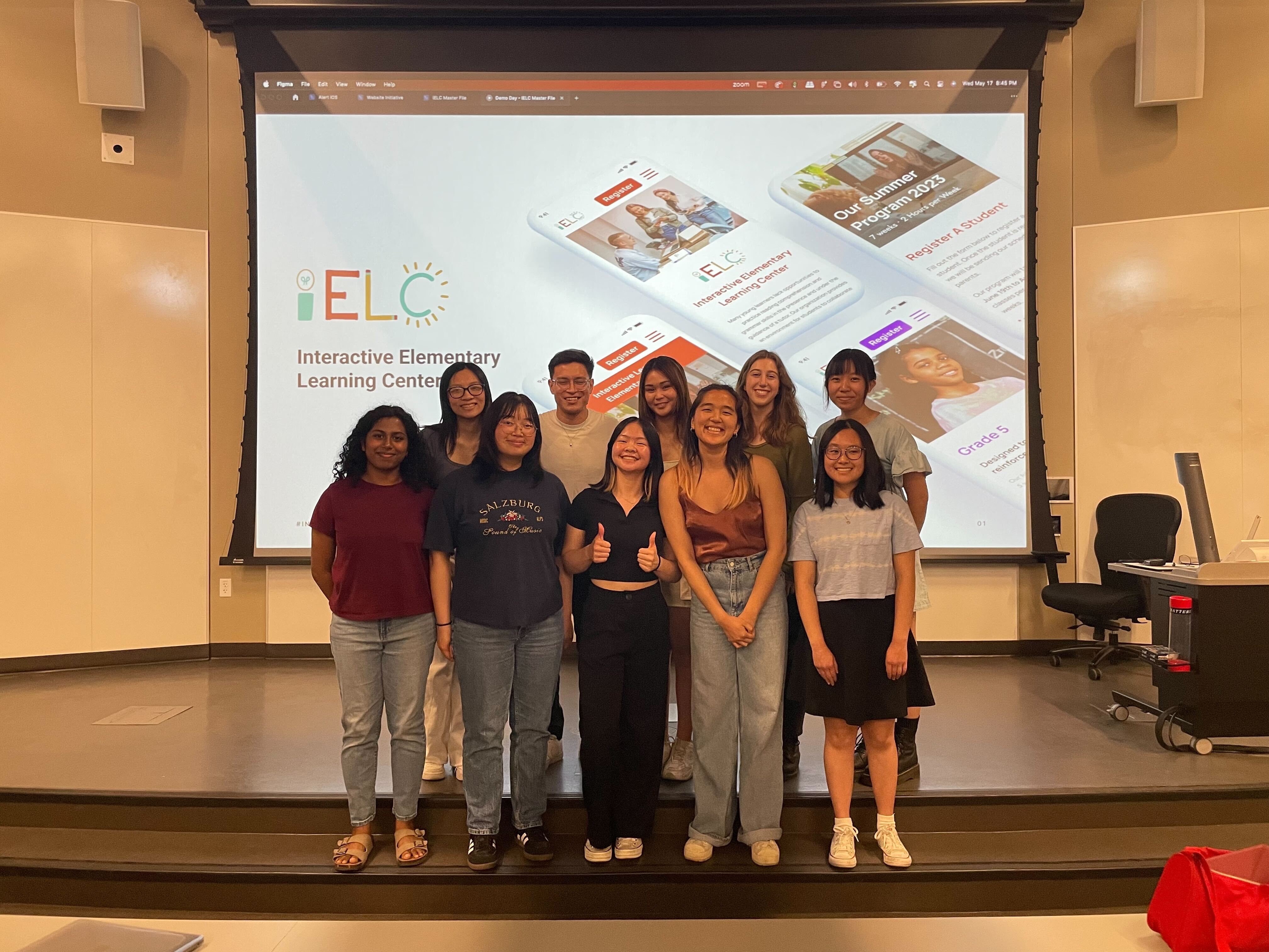
Thanks for visiting!
I'd love to chat about projects,
opportunities, and all things design.
Contact me :)